The Challenge
The application’s primary revenue stream was plateauing. Despite having a unique “Add-to-List” feature, the legacy ad system suffered from UX friction, intrusive dark patterns, and a fragmented design.
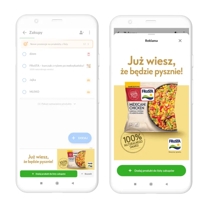
The core value - adding products directly to the list - was buried under poor UI and unstable JavaScript-to-Native communication. Visually, ads felt like “foreign bodies” in the app, leading to ad blindness. We needed to bridge the gap between this powerful utility and a seamless user experience.
My Strategy & Actions
As the Product Manager, I led a cross-functional pivot focused on UX exposure and technical stability:
- UX & Visibility Optimization: I refocused the design on the “Add-to-List” action. By removing dark patterns and optimizing the exposure of the “Add” button, we made the utility obvious and effortless for the user.
- Diverse Engagement Models: Recognizing that not every campaign is about immediate purchase, I introduced a flexible CTA framework. Beyond the core “Add-to-List” (ATL) functionality, we implemented new interaction types such as “Learn More” for brand awareness and “Enter Contest” for lead generation.
- Architecture Overhaul: Oversaw the complete refactoring of the JavaScript-Native bridge. We replaced a fragile, legacy communication layer with a robust, standardized architecture, ensuring all CTA actions worked instantly every time.
- Native Design Integration: I led the effort to unify ad styles with the app’s design system. By using the same typography and spacing as the native shopping list, we increased user trust and the perceived value of the promoted products.
- Operational Velocity through Standardization: Previously, the Sales team had to collect multiple, often non-standard ad creative formats. I reduced this complexity to just three universal sizes that work seamlessly across our entire product portfolio, moving from a “custom-build” to a scalable “plug-and-play” model.
The Results & Strategic Impact
The transformation proved that how a feature is presented is just as important as what it does:
- 4x CTR Increase (300% Growth): Better exposure of the utility and cleaner UI led to a fourfold increase in engagement.
- Premium Market Position: By turning ads into a high-performing utility, we built a significant competitive advantage, offering direct clients a format that captures users at the “Zero Moment of Truth.”
- Direct ROI for Clients: Improved UX made it easier for users to transition from viewing an ad to planning a purchase, resulting in measurable ROI and higher conversion rates for our partners.
- Operational Excellence: Standardizing creative requirements and refactoring the engine led to a significantly faster sales cycle, fewer onboarding errors, and reduced maintenance costs.
- Expanded Product Offering: The introduction of multi-CTA capabilities transformed our ad engine into a versatile marketing platform, allowing us to effectively serve diverse industries beyond FMCG.
Summary
This project was a masterclass in UX-driven monetization. By prioritizing the exposure of our most valuable features and stabilizing the underlying tech, we achieved the “Golden Ratio”: exponential revenue growth, a premium brand for direct clients, and a seamless experience for our users.